The Slot API pattern is a pattern which is used extensively throughout the Compose UI codebase. The Compose team at Google arrived at this pattern after numerousiterations at finding an idiomatic way to architect the standard set of composables.
What is the ‘Slot’ API pattern?#
In a nutshell, it implements the idea of components having a single responsibility. As components grow more complex, there’s a tendency from past experience to create components which have very simple inputs, but lots of complex implicit behavior.
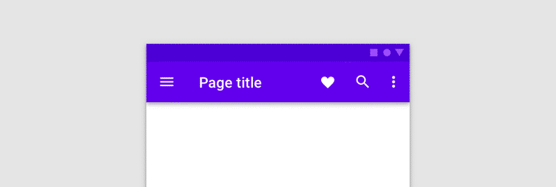
Let’s look an example, the top app bar (aka Toolbar):

When looking at this component, there are some clear inputs:
- Navigation icon (on the left)
- Title
- Subtitle (not pictured)
- List of actions, with an overflow
If we were to model this in an API, you might create something like this:
@Composable
fun TopAppBar(
    navigationIcon: Painter?,
    title: String,
    subtitle: String? = null, // optional
    actions: List<Action> = emptyList(),
)
This API models the API on the view Toolbar class pretty closely (with the equivalent primitives).
Now I’m not saying that the above API is bad, but it _ is _ inflexible. TopAppBar(), much like Toolbar is responsible for converting all of those ‘simple’ inputs into layout, and there’s a lot of implicit behavior which the function now has to provide:
- How is the title laid out vs the subtitle?
- What happens when there are too many actions to fit on screen?
Then comes the inflexibility:
- What if I want to animate changes to the actions?
- What if I want to provide some rich text as the title?
- What if I want to use some complex content for the navigation icon?
- What if I need to change the title line height? (or any of the other parameters on
Text?)
These questions illustrate one of the problems which the slot API pattern attempts to fix (successfully in my opinion). So let’s look at the actual TopAppBar implementation:
@Composable
fun TopAppBar(
    navigationIcon: @Composable (() -> Unit)? = null,
    title: @Composable () -> Unit,
    actions: @Composable (RowScope.() -> Unit)? = null,
    // ...
)
In summary, all of those ‘simple’ inputs have been replaced with composable content lambdas, allowing it to delegate each slot’s content to the caller. Usage then becomes the following:
TopAppBar(
    navigationIcon = {
        Image(...)
    },
    title = {
        Column {
            Text(...) // title
            Text(...) // subtitle
        }
    },
    actions = {
        IconButton(...)
        IconButton(...)
        IconButton(...)
    }
)
This allows clients to provide whatever content they want in the different ‘slots’ which TopAppBar exposes. Clients can easily animate things, or provide custom layouts, or anything else they wish. By doing this, TopAppBar is kept as a simple pluggable layout.
Single responsibility principle#
The skeleton and pluggable approach is how the single responsibility principle is achieved through the Slot API pattern. Clients can easily build complex components themselves by bringing together different independent pieces of code.
If we look back to the question of “What if I want to provide some rich text as the title?", the slot API allows clients to swap out the Text() for something else:
TopAppBar(
    title = {
        RichText(...)
    },
)

@Composable
fun RichText(...) {
    val annotatedString = buildAnnotatedString {
        ...
    }
    Text(annotatedString)
}
The RichText() composable here is just a wrapper around Text(), but the key thing is that it has no relationship to TopAppBar(). It is only responsible for drawing some rich text.
This does not mean that clients need to write RichText() themselves though. This could be provided alongside TopAppBar() in your design system components.
This pattern also can also be extended if you need to provide parent-specific ‘child’ composables. If we look at the Compose Material TabRow(), it provides a slot for the tabs, but then also provides the Tab() composable which gives you all of the nice default styling for a single tab:
@Composable
fun TabRow(
    tabs: @Composable () -> Unit,
    // ...
)

@Composable
fun Tab(...)
Clients can then use the Tab() composable or not, it’s up to them:
TabRow(
    tabs = {
        // We can even use a mix of tab types
        Tab(...)
        CustomFancyTab(...)
        CustomImageTab(...)
    }
)
The single responsibility principle also greatly accelerates testing. You can test each piece in isolation without having to test implicit and complex behavior.
Style parameters 🎨#
Semi-related to the slot API pattern is the usage of data class inputs, which work as a style for the component. This is something I’ve seen grow in usage on forums and elsewhere to help model components which have a fixed set of design styles.
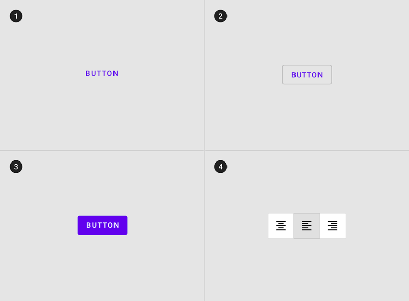
Let’s take the Material button as an example. It has 4 styles which are all mostly the same:

In views, you can imagine this being implemented as different styles. Something like this:
<MaterialButton
    style="Widget.Material.Button.Text" />

<MaterialButton
    style="Widget.Material.Button.Outlined" />

<MaterialButton
    style="Widget.Material.Button.Contained" />

<MaterialButton
    style="Widget.Material.Button.Icon" />
If you were to map this directly in Compose, you’d probably end up with something like this:
@Composable
fun Button(
    style: ButtonStyle,
    // ...
)

sealed interface ButtonStyle {
    data class Text(val text: String)
    data class Outlined(val text: String)
    data class Contained(val text: String)
    data class Icon(icon: Painter)
}
On the face of it, this looks like a nice API, and it is for _ the _ moment in time when it is written. The issue with this pattern is the same thing which we spoke about above with TopAppBar, it’s inflexible for the future.
It also has a larger issue, which we’ll see by taking a deeper look at the contained style. If we expand that class, it would probably look more like this:
data class Contained(
    val text: String,
    val icon: Painter,
    // These default values won’t work as they need to be called
    // from a composable context (i.e. function)
    val background: Color = MaterialTheme.colors.primary,
    val contentColor: Color = contentColorFor(background),
)
The constructor has no access to a composable context, which means that you can not use composable calls for any default values.
You could workaround this by using composable lambdas instead:
data class Contained(
    ...
    val background: @Composable () -> Color = {
        MaterialTheme.colors.primary
    },
    val contentColor: @Composable () -> Color = {
        contentColorFor(background())
    },
)
But you no longer have immutable ‘state’ as input, and you’re now requiring callers to only use these classes from composable functions, which breaks testability.
So what should we do instead? Well let’s look at what the Material Compose library provides:
@Composable
fun Button(...)

@Composable
fun TextButton(...)

@Composable
fun OutlinedButton(...)

@Composable
fun IconButton(painter: Painter?, ...)
The pattern used consistently through the Compose libraries is that styles are modeled as different composable functions. This allows each function to have different parameters which are relevant. Any complex default parameter values can be extracted and encapsulated into a defaults class, in this instance ButtonDefaults.
If you’re interested in reading more about the evolution of the Button APIs, you can read a great deep-dive here:
Should you use this for your in-house components?#
You might be reading this thinking: “we have access to all of the client code which uses our components, why make the components flexible when we can refactor code as we need?"
In my experience leaning on the side of flexibility tends to lead to fewer future problems
That’s a fair question, and one which is up to each team which writes their own components to answer. If you have a really strong need to restrict changes to the appearance of a component then the slot pattern might not be the right solution. Only you as a team can make that judgement call, but in my experience leaning on the side of flexibility tends to lead to fewer future problems.
My counter question would be: What happens if a client comes to you with some requirement which the current components can’t meet?
You either leave them blocked, or you drop what you’re doing to unblock them. Rushing changes like this tends to lead to bugs though, so having extensive UI testing is key, something which a lot of teams in my experience don’t have.
The slot API allows the client to provide whatever custom thing they need in a very small specific place. They can still continue to use the overall skeleton which you provide, and maybe even contribute those changes back at a later date.
Other benefits#
There is another benefit which goes beyond creating cohesive and uncoupled components. The slot pattern allows you to simplify how data flows down your layouts, and almost acts as a shortcut to avoiding the dreaded prop-drilling effect. Kiran Rao explains here:
Putting the pieces together 🧱#
Hopefully this blog post has been useful in showing you how you can architect your composables to achieve the same benefits which the standard Compose UI composables provide.
Thanks to Nick, Nacho, Will, Ataul & Taylor for reviewing this
