Haze 1.0 is out and ready for your blurring pleasure. This version marks a dramatic change in how the library works, along with new features, which I’m really pleased with.
Before we go into that though, some of you reading this blog post may not know what Haze is, so let’s take a look at what it provides…
What is Haze?#
In simple terms, Haze is a library which aims to provide a way to achieve background blurring on Jetpack Compose and Compose Multiplatform.
Compose actually already has support for blurring content, through the blur modifier, but this modifier is built to blur the exact content that you set it on. It’s great for when you need to quickly blur an image, but unfortunately it doesn’t cover other common use cases for blurring.
In recent years there’s been a move towards using glass-like materials in UIs. To achieve a glass material effect, you actually need to blur whatever content is drawing behind. Since this means that you need to know where multiple drawing things are located on screen, the problem starts getting complicated real-fast.
This is why I created Haze: to make it as simple as possible to implement background/backdrop blurring in your UIs.
So that’s a quick summary of what Haze is and does. If you would like to know more about Haze, you can check out the website:
Let’s dig into some of the big changes…
Layers, layers everywhere#
Haze has been completely rewritten to work on top of the new GraphicsLayer APIs in Compose 1.7.
GraphicsLayers are a new feature in Compose, which wrap the various graphics layer APIs on each platform, such as RenderNodes on Android. Haze has always used RenderNodes on Android, but migrating to GraphicsLayer means that we now use a commonized API, allowing Haze to use the same logic on all platforms.
This has resulted in Haze now having a single implementation across all platforms, re-using the older Android implementation, and building on top of it with a load of new features (more on that below).
The real big benefit is that this should help minimize platform differences and bugs in the future, as well as make feature development easier.
New pipeline#
In older versions of Haze, the effect is all ‘smoke and mirrors’. It draws all of the blurred areas in the haze layout node. The hazeChild nodes just update the size, shape, and styling information, which the haze modifier reads, to know where to draw. It was implemented this way as we didn’t have a generic way to pass drawn content around, which worked on all platforms.
With the adoption of GraphicsLayers, we now have a way to pass ‘drawn’ content around, so we are no longer bound by the restraints of before. Haze 1.0 contains a re-written drawing ‘pipeline’, where the blurred content is now drawn by the hazeChild, not the parent. The parent haze is now only responsible for drawing the background content into a graphics layer, and putting it somewhere for the children to access.
This fixes a number of long-known issues on Haze, where all were caused by the fact that Haze was inverting the drawing order.
Here’s a demonstation in the layout inspector. You can see that the blurred content is drawn within the child (the app bar), rather than the background content (the grid).
Such speed#
After such a big re-write, I was fearful that performance would drop but the good news is that Haze 1.0 is faster than Haze 0.7.3 (last stable release), according to our benchmarks ran on a Google Pixel 6. All of the benchmarks exercise different scenarios, and we mostly compare the P50 frame duration (aka the median duration for how long frames take to draw to screen), during some repeated scrolling or dragging.
According to the benchmarks:
- Scaffold is 10% faster.
- Credit Card is 4% faster.
- Images List is 3% faster.
The most common scenario which Haze is used for is covered by the ‘Scaffold’ sample (you’ll see it used a lot below), so expect a 10% gain in draw performance once you upgrade! As always though, performance is something which is specific to every app. You should measure your own app and work out the cost.
We don’t currently have a way to run benchmark tests on non-Android platforms, but the good news is that all of the commonization that we spoke about above means that the implementations are 95%+ the same. I don’t have any numbers to back this up, but I’d expect a similar performance benefit on non-Android platforms.
That’s enough about how the underlying library has changed, now let’s talk about some neat new features.
Progressive blurring#
Also known as gradient blurring.
This is a new feature in Haze 1.0, which provides an effect where the blurring radius changes across a dimension. This effect is commonly used on iOS, so you’ll likely have already seen it in action.
Here’s an example where the blurring is strong at the top, and then progressively decreases towards the bottom of the app bar:
Progressive blurs can be enabled by setting the progressive property on HazeChildScope. The API is very similar to the Compose Brush gradient APIs, so it should feel familiar:
LargeTopAppBar(
  // ...
  modifier = Modifier.hazeChild(hazeState) {
    progressive = HazeProgressive.verticalGradient(startIntensity = 1f, endIntensity = 0f)
  }
)Easing#
Linear gradients are a bug bear of mine as they typically look less refined, especially when transparency is involved, such as with scrims. To combat this, the progressive APIs support passing of an Easing function, which is then used to provide a more natural looking gradient. Haze defaults to using the EaseIn, which has a subtle curve:

However, you are free to use whatever easing curve you wish. Here we’re passing in EaseInCubic which has a stronger curve:
LargeTopAppBar(
  // ...
  modifier = Modifier.hazeChild(hazeState) {
    progressive = HazeProgressive.verticalGradient(
        easing = EaseInCubic,
    )
  }
)
“Hang on, aren’t easing functions used for animations?” I hear you ask.
Yes, but they’re also just functions which return the rate of change, over a dimension. Usually that dimension is time, but they also work perfectly over a distance too. By using Easing, we get all of the provided easing functions in Compose, for free.
For more information on easing curves, have a look at this great blog post by Rebecca Franks:
To compare some of the different easing curves, here’s an image showing the progressive effect using the LinearEasing, EaseIn (default) and EaseInCubic (stronger ease in) easing curves:

Implementations#
Now let’s talk a little bit about how this feature works. The first thing to note is that the method we use to draw the effect changes depending on what device we’re running on.
We have two key implementations: one which uses a custom runtime shader, and another which uses multiple GraphicsLayers drawn on top of each other. Visually they’re very similar, but they also have different performance characteristics.
This is where each implementations is used:
- Android SDK 31 and below: scrim implementation.
- Android SDK 32: Multiple GraphicsLayers.
- Android SDK 33+: Runtime Shader.
- All Skia backed platforms (iOS, Desktop, etc): Runtime Shader.
Performance#
While the effect is visually pleasing, it’s important to know that this effect does have an effect on performance.
We only have benchmark measurements on Android, but the cost is roughly the following:
- On Android SDK 33+ (runtime shader): Frame duration is ~1.25x non-progressive.
- On Android SDK 32 (multiple layers): ~2x non-progressive.
The Skia backed platforms use a runtime shader, so I think it’s safe to assume that the cost is somewhat similar.
As always though, performance is something which is specific to every app. You should measure your own app and work out the cost. If the performance turns out to be too slow for you, you may wish to look at the new masking feature instead…
Masking#
Similar to progressive blurring, masking is a new feature in Haze 1.0. It allows you to provide a Brush, which is then used as an alpha mask when drawing the entire effect, a bit like a stencil.
Here’s an example which uses a vertical gradient to provide an effect (vaguely) similar to the progressive blurring examples above:
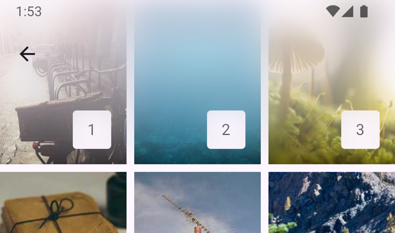
To implement this, you can use a vertical gradient like so:
LargeTopAppBar(
  // ...
  modifier = Modifier.hazeChild(hazeState) {
    mask = Brush.verticalGradient(colors = listOf(Color.Magenta, Color.Transparent))
  }
)
As you can see, this API uses the Brush APIs directly, so you can use whatever features are supported there, including radial gradients if required.
So why have I added masking, when we already have progressive blurring? Simple answer: performance. The visual effect provided by alpha masking may not be quite as finessed as progressive blurring, but it’s close enough in my opinion to be a viable alternative when performance is important.
Performance#
Simply put, masking is much quicker than progressive blurring. When running on a Pixel 6 running Android 14 (SDK 34):
- Progressive blurring: Frame duration is ~1.25x non-progressive.
- Masking: Frame duration is ~1.05x non-progressive.
In other words, progressive blurring with a runtime shader is 5x the relative cost of masking. Same caveat as before though, measure yourself.
One thing that has struck me while writing this blog post is that it would be useful to have a mode where Haze automatically uses a progressive blur where it is efficient, but otherwise uses an alpha mask. If you’re interested in that, star this issue.
Easing#
Since we’re using the Brush APIs directly, all of the gradients will be linear in nature (👎). I’ve written an interpolated eased Brush builder in our samples which you can copy from here.
These builders are also very useful for eased scrims. In fact, I originally wrote them years ago in Tivi for nicer looking scrims. This is totally unrelated to the masking feature, but if you’d like to know more about why you should use eased scrims, have a look here:
Updated styling system#
Haze supports various styling properties, allowing you to refine the visual effect to whatever you require. It recieve a new upgrades in Haze 1.0.
HazeChildScope#
Haze has had the HazeStyle class for a while now, but it the functionality has been cumbersome for scenarios when you need to modify the styling/drawing properties dynamically. Enter HazeChildScope.
We now have a parameter on Modifier.hazeChild which allow you to provide a lambda block for controlling all of Haze’s styling parameters. It is similar to concept to Compose’s graphicsLayer modifier.
It’s useful for when you need to update styling parameters using values derived from other state. Here’s an example which fades the effect as the user scrolls:
FooAppBar(
  ...
  modifier = Modifier
    .hazeChild(state = hazeState) {
      // You can set any of the styling parameters here...

      // Here we're just changing the overall opacity of the effect
      alpha = if (listState.firstVisibleItemIndex == 0) {
        listState.layoutInfo.visibleItemsInfo.first().let {
          (it.offset / it.size.height.toFloat()).absoluteValue
        }
      } else {
        alpha = 1f
      }
    },
)
Styling propogation#
The way in which you can set styling properties has also changed in Haze 1.0.
The biggest change is that the style parameter on Modifier.haze has been removed, and replaced with a LocalHazeStyle composition local. This allows you to set a default style for your entire application easily.
Since we have multiple places where you can set styling information, it’s important to know how the final values are resolved. Each styling property (such as blurRadius) is resolved seperately, and the order of precedence for each property is as follows, in order:
- Value set in HazeChildScope, if specified.
- Value set in style provided to hazeChild (or HazeChildScope.style), if specified.
- Value set in the LocalHazeStyle composition local.
New Materials#
The final thing that I want to highlight in this release is that we have new material options. Haze Materials is an add-on library where we provide pre-built HazeStyle instances for common styling. You can find out more information on the library here:
We have 3 options in Haze 1.0:
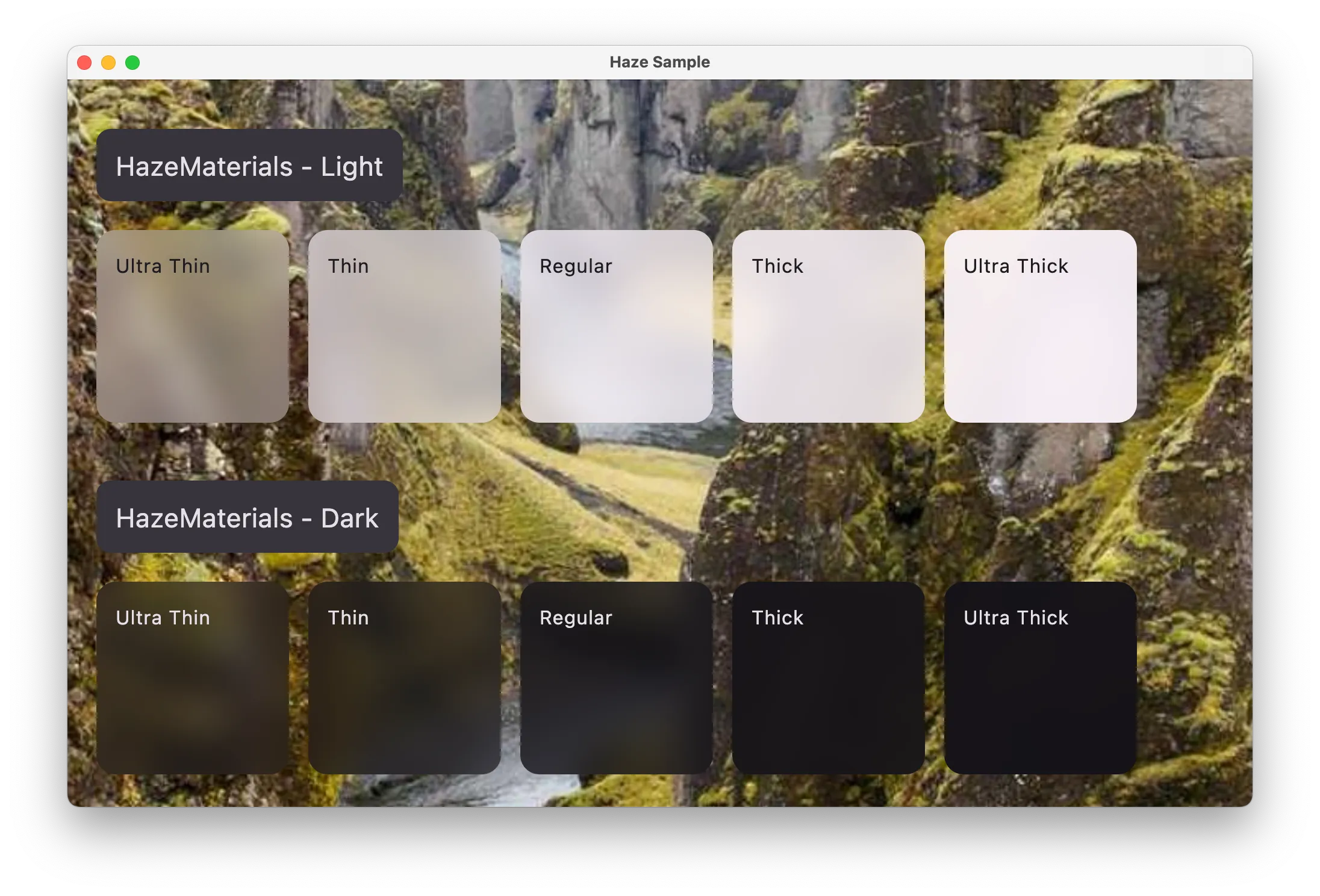
HazeMaterials#
A class which contains functions to build HazeStyles which implement ‘material-like’ styles. It is inspired by the material APIs available in SwiftUI, but it makes no attempt to provide the exact effects provided in iOS (unlike CuperintoMaterials below).
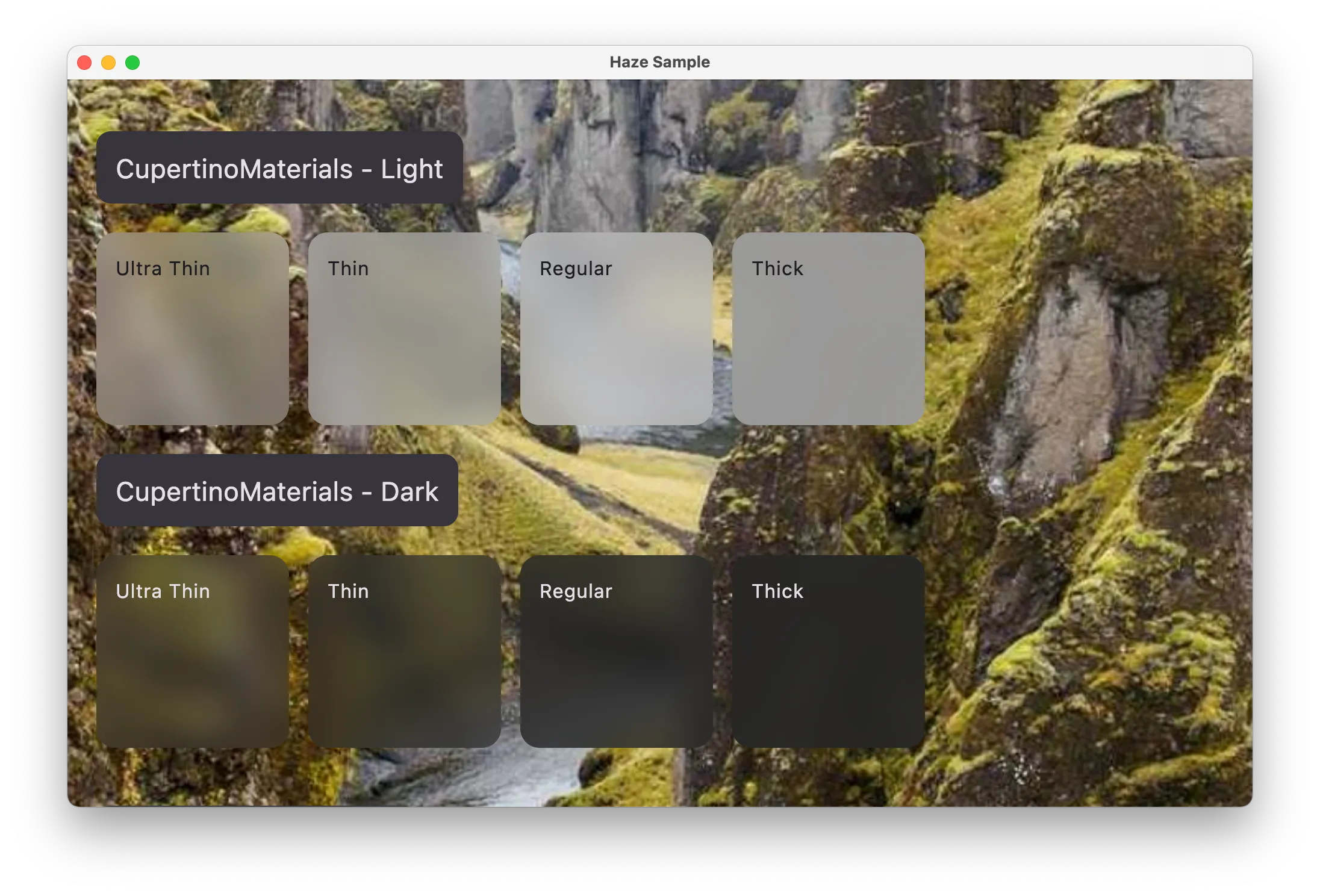
CupertinoMaterials 🆕#
These styles are similar to those available on Apple platforms, with the primary use case for using these is for when aiming for consistency with native UI (i.e. for when mixing Compose Multiplatform content alongside SwiftUI content).
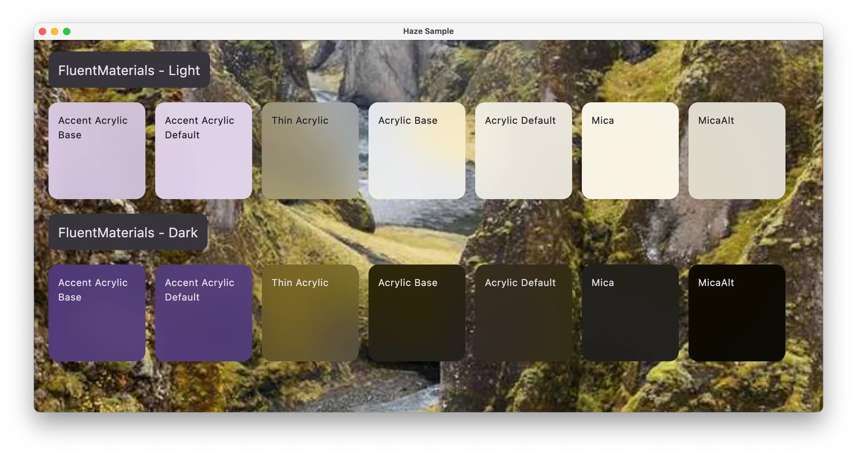
FluentMaterials 🆕#
Similar to CupertinoMaterials, but these styles are similar to those available on Windows platforms.
Seeing through the Haze#
Haze 1.0 brings the capability to easily add background blurring to your Jetpack Compose and Compose Multiplatform apps, and offers the tools you need to elevate your app’s visual experience. The new progressive blurring effects, enhanced performance, and platform-wide consistency through the GraphicsLayer API, makes it easier than ever to create visually pleasing, glass-like UI effects.
